


1. The Mighty Thor #373 (Pencils/Inks: Walt Simonson)
Before the bankruptcies, box-office hits and acquisitions by rodent-fronted conglomerates, there was plucky, spunky 1986-era Marvel Comics. It was an exciting time for the company. Not only was 1986 a good year for comics in general, it was also the year Marvel Entertainment was sold to New World Pictures, promising a bold new era in Marvel-based hit films (…eventually). It was also Marvel’s 25th anniversary, assuming you start counting from the year that Fantastic Four #1 hit the stands, and Marvel celebrated that milestone by… launching a forgettable “New Universe” line of books. Also? These covers. All regular titles with a November 1986 cover date featured portraits of Marvel characters framed by a border designed by “Jazzy” John Romita. And the best of the bunch? This rendering of Thor by then-current Thor writer/artist Walt Simonson. Maybe it’s the shadow hiding half his face, or the look of grim determination in his eye, or how Simonson’s signature looks like a dinosaur and I’ll never stop loving that — whatever it is, it makes this cover a damn fine piece of work.
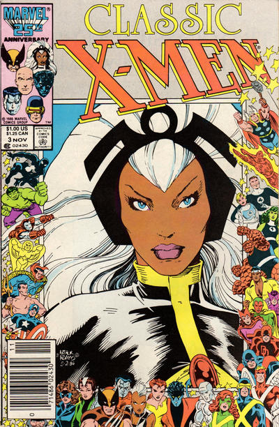
2. Classic X-Men #3 (Pencils/Inks: Arthur Adams)
Man, was I a huge Art Adams fan back in the day. Art’s art (ha!) first caught the attention of most fans when he worked on the Longshot mini-series in 1985; he later went on to produce many fine stories, particularly the Uncanny X-Men annuals in the 1980s that lured me into collecting X-Men books (that and Paul Smith’s work on the monthly title). Like most newbie comic fans, I started out collecting favorite characters and only later realized there were different people involved in producing each book; Adams was one of the first artists whose art I recognized by sight (not that it was hard, given his unique style) and it drove me nuts that his labor-intensive style never allowed him to do more than an occasional fill-in or annual issue at a time. Anyway. Early in his career, he was heavily identified with the X-Men, and so it’s no surprise he was tapped to do this beautiful rendition of Storm for this X-Men title. I’ve written before about the seemingly impractical aspects of headpieces much like the one Storm is wearing in this picture, but damn if Adams doesn’t know how to pull it off. Classic, indeed.

3. Captain America #323 (Pencils: Mike Zeck, Inks: Joe Rubinstein)
Mike Zeck is another of my favorite artists from those days; check out the first Punisher mini-series and “Kraven’s Last Hunt” for some really nice examples of his work. Zeck also put in his fair share of time on Captain America, penciling most issues between #258 and #289. I like this image because it’s exactly how you would expect Captain America to look in real life: square-jawed, confident, a little bit on the corny side, but somehow the perfect amount of optimism and can-do spirit that makes you want to follow that man into the jaws of hell, silly head-wings be damned. The wavy stripes are a nice touch, too.

4. Uncanny X-Men #211 (Pencils: John Romita, Jr., Inks: Bob Wiacek)
Another indelible X-Men image, this one courtesy of John Romita, Jr. (as in, the son of the guy who drew the anniversary border; a nice touch, that) and Bob Wiacek. No surprise, Marvel went for the team’s most popular character for this portrait cover, just as it’s no big surprise they would show him in the middle of a brutal battle as opposed to posing in the same grade-school picture day manner as everyone else. Fun fact: the story inside is a chapter in the “Mutant Massacre” storyline that ran through several Marvel books at the time, making this image of a beaten Wolverine all the more apropos.

5. G.I. Joe #53 (Pencils: Mike Zeck, Inks: Joe Rubinstein)
If you think that I, a proud child of the ’80s, will waste a lot of time explaining the awesomeness of a Mike Zeck image of Snake-Eyes, then get out. Now.

6. The Transformers #22 (Pencils/Inks: Herb Trimpe)
And that goes double for Megatron. But since we’re all here… did it ever strike anyone else as odd that some of the Transformers had fully articulated mouths and faces, while others were sporting the blinking balaclava look? Did they ever explain in the comics or in the cartoon how that worked? Did Transformer kids tease each other about this? “Hey, Optimus, where were you when the Allspark was handing out mouths?” “Um… getting assembled in Sector 7-G, same as the rest of the Autobots?”

7. The West Coast Avengers #14 (Pencils: Al Milgrom, Inks: Joe Sinnott)
“Hell-ooooooo, ladies.” Remember that fun time in Avengers history, when they had a West Coast headquarters, and Hawkeye had short sleeves cut in his costumes, and the team members would occasionally take swipes at L.A. traffic and culture? Good times. At any rate — I don’t know if this was a colorist’s error or if Hawkeye always covered his ears with a stretchy fabric that perfectly followed the contours of his ears, but it looks damn strange, especially after looking at Cap’s image above. Ditching the mask and hood was one of the many smart choices the Ultimate universe version of Hawkeye (and Jeremy Renner) ever made.

8. Alpha Flight #40 (Pencils/Inks: Dave Ross)
Alpha Flight was never one of Marvel’s more popular books; the plotlines often verged on the ridiculous (next issue: Sasquatch shape-shifts into a girl! And has to convince a court he’s not dead so they don’t give his estate to his vengeful ex-wife!), and none of the characters (save perhaps Northstar) went on to bigger and better things — least of all Vindicator, the gal in the goggles pictured here who only took over the team when her superhero husband died in the line of duty. So why the high marks? Because I like how Ross got around the “you can only have one person on the cover” rule that artists were apparently ordered to follow for these covers by depicting the rest of her team as reflections in her goggles. As pretty as many of these covers are, one of the drawbacks of this event became evident when you start looking at the team books like Avengers, New Mutants or Alpha Flight: one of the biggest strengths of the Marvel universe is the spirit of camaraderie within its team titles, and this cover pays homage to that spirit in a very sneaky way. I like sneaky.

9. The Amazing Spider-Man #282 (Pencils: Rick Leonardi, Inks: Bob Layton)
This cover came out during that post-Secret Wars, pre-Todd McFarlane period in Spider-Man’s life when he swung around town in a black costume. The first version of this costume was the alien symbiote we’re all familiar with, while the second was the same black-is-the-new-black look made out of normal Earth fabrics. I don’t recall a lot of schoolyard knife fights over which costume was better, but I’m pretty sure I wasn’t the only one wondering when the book would get back to the classic threads Spider-Man sported in my Saturday cartoons. Anyway, black-suited or otherwise, I like this cover because of course Spider-Man would pose for his official portrait like this. It’s kind of his thing.
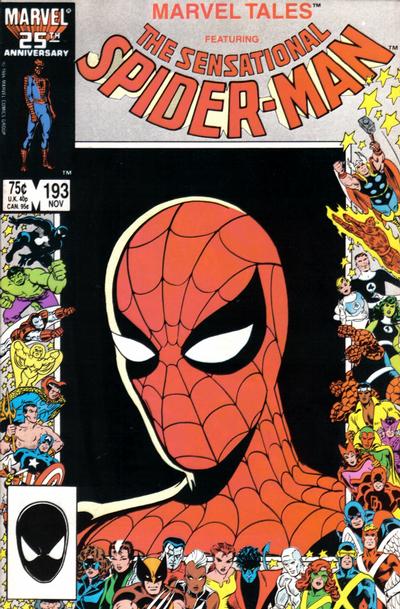
10. Marvel Tales #193 (Pencils/Inks: Steve Lightle)
Speaking of the classic look. Marvel Tales was a title that reprinted classic Spider-Man stories from the past; when I started collecting Marvels in the mid-’80s, Marvel Tales was re-presenting all the classic Lee/Ditko Spider-Man stories that introduced the villains I knew and loved from Saturday afternoon reruns of the classic Spider-Man cartoon. Drawing Spidey here as he looked during Ditko’s run was a no-brainer; it’s a shame Ditko himself couldn’t be coaxed to come back to the character he co-created, even if just for this cover. Too busy working on his Speedball sketches, I suppose.

11. The New Mutants #45 (Pencils/Inks: Barry Windsor-Smith)
No need to get into a lengthy diatribe about the genius of Barry Windsor-Smith here, but I have to admit I found this image of Magik, the team’s resident sorceress, to be… well, kind of meh. It might be the half-asleep look on her face, or how some of those hair accessories look glued on to her hairdo — I can’t put my finger on it. In any case… it’s okay. Not great, just okay.

12. Cloak and Dagger #9 (Pencils/Inks: Terry Austin)
Another fine artist for whom I will never have an unkind word, I thought Terry Austin’s talents were wasted here. Cloak’s not the hardest figure to do — draw part of a face, surround with sea of black and blue inks — and Cloak’s grimace says “routine dental exam” to me more than anything else. Plus, given how we only have three female characters featured in these 29 covers, I’d like to have seen how a portrait of Dagger would have looked here. Ah well.
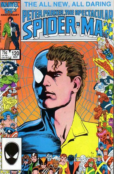
13. Peter Parker, the Spectacular Spider-Man #120 (Pencils: Mark Beachum, Inks: Joe Rubinstein)
Or, if that title’s not long enough for your liking, The All New, All Daring Peter Parker, the Spectacular Spider-Man. I never figured out why that title included Peter Parker’s name; it’s not like there were other books titled Bruce Wayne, the Impressive Batman or Clark Kent, the Really Quite Astounding Man of Steel, Who Is Also Known as Superman, In Case You Didn’t Know. I guess it makes sense a book with “Peter Parker” in the title would emphasize the man behind the mask, complete with a subtle shout-out to the classic “spider-sense tingling” panels that Ditko drew back in the day. Still, this image left me feeling… not exactly indifferent, but… not quite opposite of indifferent, either. (Different?)

14. X-Factor #10 (Pencils/Inks: Walt Simonson)
This image, on the other hand… indifference all the way, baby. Really, the only reason why I’m not ranking it lower is because it’s a Walt Simonson original. That’s literally the only thing keeping me from sending this cover right to the bottom of the list, festooned as it is with the unsmiling mug of the most self-righteous, stick-up-his-ass prig in all of mutantdom.

15. The Avengers #273 (Pencils: John Buscema, Inks: Tom Palmer)
This fellow’s the Black Knight, one of the lesser-known Avengers hanging around Avengers Mansion when this book was published. There’s nothing particularly bad about this portrait; I’m just at a loss trying to figure out what that look on his face is about. Is he trying to look resolute? Determined? Aware of the awesome responsibilities he has taken on himself? Because I hate to say it, it looks more like “Dad’s face when you come home with a dent in the minivan’s bumper.”
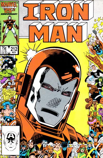
16. Iron Man #212 (Pencils: Mark Bright, Inks: Joe Rubinstein)
Hey, remember that phase in Iron Man’s career when he sported this particular red-and-white suit? Yeah, it didn’t last long. The “close-up portrait” pose isn’t the best way to showcase a character like Iron Man for obvious reasons — it’s kind of hard to appreciate a close-up of someone’s face when said face is almost completely hidden by a mask (Spider-Man is another example, but as we saw with the Amazing Spider-Man cover, there are other ways — like rotating the head until it’s almost upside-down in the frame — to convey Spider-Man’s playful character). The artists here did the best they could with what they had, but this cover is as flat as Tony’s faceplate.

17. Conan the King #37 (Pencils: Judith Hunt, Inks: Art Nichols)
Never read any of the Conan books myself, and I don’t really see myself feeling the urge to start any time soon. I watched the first Conan movie starring a young Ah-nuld as the titular barbarian… aside from that, nada. So let me just say that is one impressive-looking hat. Nobody messes with a guy wearing a hat like that.

18. Conan the Barbarian #188 (Pencils/Inks: John Buscema)
Ditto here. Ranked this cover just below the other one featuring Conan because (1) the floating-head side profile thing isn’t working for me and (2) I’m guessing this not-as-impressive horned helmet was from his earlier, non-king days.

19. Marvel Age #44 (Pencils: Alan Kupperberg, Inks: Joe Sinnott)
For you youngsters raised in the Internet Age, Marvel Age was a promotional magazine put out by Marvel from 1983 to 1994. It contained a checklist of all the Marvel books that shipped out that month, along with articles promoting upcoming projects and interviews with comic creators (think of it as a book-length Bullpen Bulletins column). Of course, the big news for Marvel fans in this issue was the launch of the New Universe, an imprint featuring books that shared their own universe separate from the “official” Marvel universe. The brainchild of then-EIC Jim Shooter, the New Universe line-up was pitched as “the world outside your window,” with the characters existing in a world that was intended to be more realistic than the world inhabited by Spider-Man and friends (which itself started out as a more realistic version of DC books, with heroes flying around New York City instead of Gotham or Metropolis). A combination of corporate pressures and editorial blunders eventually doomed the whole project, but at least it was an interesting experiment in trying something new. The blond fellow here is Star Brand, a New Universe Earthling who is given a power called the Star Brand by a mysterious visitor from space. Also, check this out:

Since Marvel Age didn’t have advertising (and therefore no back cover ad), the artists decided to have some fun with the anniversary concept by showing the back of Star Brand’s head on the back cover, as well as the backs of all the figures in the surrounding border. Cute. (Though the OCD part of me can’t help but wonder why it looks like Reed Richards’s elongated legs are coming up in the frame just behind Star Brand’s shoulder in the image on the left, but we don’t see his legs in the same position on the right…)

20. The Incredible Hulk #325 (Pencils/Inks: Al Milgrom)
Yep, that’s an Al Milgrom, all right.


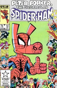
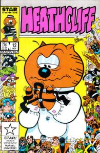

21-26. Various Star Comics Titles
Star Comics was a Marvel imprint between 1984 and 1988 that focused on kids’ comics. There was a mix of titles based on licensed properties and original concepts, as you can see here. I won’t get into the who’s who for each of these covers; I’ll just say I’m sure all corporate partners involved with Marvel on these titles were fine with the results. Damned odd seeing a Care Bear, Ewok and Baby Kermit surrounded by superheroes, though.

27. Daredevil #236 (Pencils: Walt Simonson, Inks: Bill Sienkiewicz)
From the era officially known as “after Frank Miller left and before Kevin Smith came on board for the relaunched series,” this substandard rendering of the Man Without Fear is clearly the work of amateurs who — wait a second. Walt Simonson? Bill Sienkiewicz?!? Two of my favorite artists from that decade collaborated to give us this?!? It’s like going to see Cowboys vs. Aliens and wondering how so many talented people came together to screw up something so simple. I mean, okay, maybe Walt and Bill were going for something noir, perhaps trying to re-create some of that same vibe that Miller and Klaus Janson generated during their run on Daredevil in the early ’80s… but no. So close, but no.

28. Web of Spider-Man #20 (Pencils/Inks: Does it matter?)
Oh, for the love of… okay, fine, I get it, you’ve got Spider-Man starring in four titles at this point and you’re running low on cover ideas. You’ve got Classic Threads Spider-Man, Back in Black Spider-Man, and a half-and-half image of Parker and his swingin’ alter ego. So where do you go from there? Apparently, you miss the point of the anniversary event altogether and slap a “Spidey spotlight” image on the cover of Web of Spider-Man. Which really sucks, because at the time this title was the “experimental” title in the Spider-Man line, offering new and offbeat creators a chance to work on stories that were a little different from the serial dramas taking place in Amazing and Spectacular (don’t worry, Marvel put a stop to those creative shenanigans shortly after this issue). Wouldn’t it be cool to have an unconventional artist offer his interpretation of Spider-Man here? Who wouldn’t have loved to see R. Crumb or one of the Hernandez brothers, just to give two examples, take a shot at depicting Marvel’s flagship character? Instead, we get… this. Boo, Marvel! Boo, I say!

29. Fantastic Four #296 (Pencils/Inks: Barry Windsor-Smith)
Look, it’s the Thing! Or possibly a flasher with a serious case of eczema. Hard to tell from this vantage point. Seriously, what the hell, people? Why would you create an entire event celebrating the 25th anniversary of the Fantastic Four title — an event in which we see lots of covers showing close-ups of peoples’ faces — and then cover up the Thing’s face? This book is the reason why all the rest of them exists, and it should have been the most spectacular cover of all… and instead we get an over-the-shoulder shot of Ben Grimm on his way to a peepshow. I mean, sure, if you had to go with only one FF face on the cover, then the Thing is the obvious choice, and he does wear a turned-up collar and fedora (always an impenetrable disguise for any superhero) in the story, but… man, what a wasted opportunity. Legend has it these covers came out during a time of turmoil in Marvel’s offices; Shooter was on his way out as editor-in-chief, FF writer/artist John Byrne had just recently jumped ship to work on Superman for DC, and the lawyers were queasy about any mention of Jack Kirby’s many contributions to the Marvel universe, including his work on the book that started it all. So maybe that all contributed to whatever forethought resulted in this mess of a cover.
1 comment:
What a great post. I love the way you curate all this information. I have every copy.
Post a Comment